Sunrise Exchange.
A website for a cross-border exchange and transfer service. The job: make people trust a site with their money and get through the exchange without a support chat.
Money likes clarity.
Sunrise exchanges USDT and fiat, sends transfers abroad and pays supplier invoices in China, South Korea and Europe. Its clients are people living abroad and businesses that buy goods overseas.
In this industry a visitor decides in seconds whether to trust a site. So the site had to show the exchange itself right away, explain every step in plain words and remove the fear of card verification.
Six decisions.
- 1
Exchange on the first screen
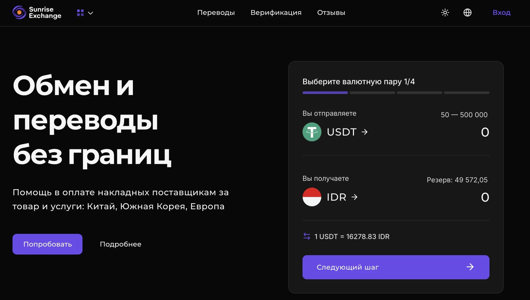
A 4-step widget next to the headline: pick a pair, enter the amount and see the rate, limits and reserve straight away.
- 2
A 6-step guide
From choosing the direction to the payout, with tabs for card transfer and cash withdrawal.
- 3
Verification in plain words
We explain why a card photo is needed and how to take it, so the step doesn't scare people off.
- 4
Personal account
Referral programme, cashback and saved details for faster repeat transfers.
- 5
Trust blocks
Customer reviews, the Sunrise Journal blog, FAQ and AML/KYC policy pages.
- 6
Two languages
Russian and English versions for clients in Asia, the UAE and Europe.
This is the widget.
We rebuilt the first step in Sunrise's own style. Enter an amount: the receive field and the limit check update instantly, exactly as on the live site.
Demo: the rate is fixed from the design mock-up, no real exchange happens.
Choose a currency pair 1/4
Dark, calm, with one accent.
Violet is used only for actions: buttons, progress and the active step. That way the eye always finds what to press next, and the dark background reads as serious, like a banking app.
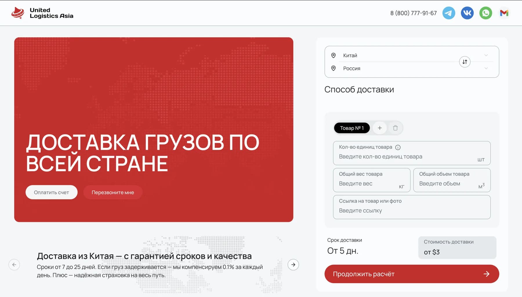
United Logistics Asia.
A cargo website with a delivery calculator. Full case study coming soon.
All cases